3. Basic Statistics
Damian Trilling and Penny Sheets
This notebook is designed to show you some ways to use python for basic statistical analysis of numbers, and to explore some methods that go beyond df.describe() or Counter(), which we used last week. In particular, we are going to look into analyzing numerical data. Next week, we will focus on textual data.
The dataset we use in this example is a subset of the data presented in Trilling, D. (2013). Following the news. Patterns of online and offline news use. PhD thesis, University of Amsterdam. http://hdl.handle.net/11245/1.394551
Import our tools/modules/libraries
As always, we first import the tools we’ll need. Today, we’ll use pandas (usually imported as “pd”), and something called statsmodels, and something called numpy. We also use matplotlib for some visualizations. A lot of other stuff here we will need for some specific analyses later on; you don’t have to worry about all of it right now.
If you want to learn more about these modules, you can look online for info.
import pandas as pd
import matplotlib.pyplot as plt
%matplotlib inline
import seaborn as sns
import statsmodels as sm
import statsmodels.formula.api as smf
from statsmodels.stats.weightstats import ttest_ind
from scipy.stats import kendalltau
import numpy as np
Read data into a dataframe
We will read a dataset based on Trilling (2013). It contains some sociodemographic variables as well as the number of days the respondent uses a specific medium to access information about news and current affairs.
You should download the dataset (with the ‘save page as’ method, making sure .txt isn’t appended to the file extension) into the same folder as this jupyter notebook: https://raw.githubusercontent.com/damian0604/bdaca/master/ipynb/mediause.csv
Remember that the ‘df’ here is arbitrary; last week we used the names ‘iris’ and ‘stockdata’ and others; this week we’re going more basic and just saying ‘df’ for dataframe.
# df = pd.read_csv('mediause.csv') # if you downloaded and stored the file locally
df = pd.read_csv('https://raw.githubusercontent.com/damian0604/bdaca/master/ipynb/mediause.csv') # if directly reading it from source
Using the .keys() method is way to find out what the columns are in your dataframe. Sometimes they have nice labels already, and sometimes they don’t. In this case, we’re in luck.
df.keys()
Index(['gender', 'age', 'education', 'radio', 'newspaper', 'tv', 'internet'], dtype='object')
Remember that for a dataframe or object in python, you can simply type its name in a code cell and python will display it as best it can. (In this case, it works well.)
df
| gender | age | education | radio | newspaper | tv | internet | |
|---|---|---|---|---|---|---|---|
| 0 | 1 | 71 | 4.0 | 5 | 6 | 5 | 0 |
| 1 | 1 | 40 | 2.0 | 6 | 0 | 0 | 0 |
| 2 | 1 | 41 | 2.0 | 4 | 3 | 7 | 3 |
| 3 | 0 | 65 | 5.0 | 0 | 0 | 5 | 0 |
| 4 | 0 | 39 | 2.0 | 0 | 1 | 7 | 7 |
| ... | ... | ... | ... | ... | ... | ... | ... |
| 2076 | 0 | 49 | 5.0 | 3 | 6 | 6 | 0 |
| 2077 | 0 | 51 | 4.0 | 7 | 7 | 5 | 5 |
| 2078 | 1 | 31 | 6.0 | 3 | 5 | 5 | 6 |
| 2079 | 0 | 58 | 6.0 | 3 | 3 | 1 | 0 |
| 2080 | 1 | 21 | 3.0 | 2 | 6 | 6 | 4 |
2081 rows × 7 columns
Explore the dataset
Let’s do some descriptive statistics, using the .describe() method we saw last week. This would be important if you wanted to describe the dataset to your audience, for example.
df.describe()
| gender | age | education | radio | newspaper | tv | internet | |
|---|---|---|---|---|---|---|---|
| count | 2081.000000 | 2081.000000 | 2065.000000 | 2081.000000 | 2081.000000 | 2081.000000 | 2081.000000 |
| mean | 0.481499 | 46.073522 | 4.272639 | 3.333974 | 3.111004 | 4.167227 | 2.684286 |
| std | 0.499778 | 18.267401 | 1.661451 | 2.699082 | 2.853082 | 2.517039 | 2.786262 |
| min | 0.000000 | 13.000000 | 1.000000 | 0.000000 | 0.000000 | 0.000000 | 0.000000 |
| 25% | 0.000000 | 31.000000 | 3.000000 | 0.000000 | 0.000000 | 2.000000 | 0.000000 |
| 50% | 0.000000 | 46.000000 | 4.000000 | 4.000000 | 3.000000 | 5.000000 | 2.000000 |
| 75% | 1.000000 | 61.000000 | 6.000000 | 6.000000 | 6.000000 | 7.000000 | 5.000000 |
| max | 1.000000 | 95.000000 | 7.000000 | 7.000000 | 7.000000 | 7.000000 | 7.000000 |
If you want to find out how many possible values there are for a specific variable, you can use the .value_counts() method. In this case, you select the dataframe (which we’ve called df), select the column/variable you want to examine, and then apply the method.
The output shows us that there are two values - 0 and 1 - for the ‘gender’ variable. It gives us how many instances (aka frequencies) of each of these values exist in the dataset.
df['gender'].value_counts()
0    1079
1    1002
Name: gender, dtype: int64
#as with any method, value_counts() has parameters we can adjust.
#by default, the results are sorted by size of the count, but we can
#also allow it to be random if we wanted. Compare the results.

df['education'].value_counts(sort=False)
4.0    667
2.0    323
5.0    178
6.0    396
3.0    214
7.0    219
1.0     68
Name: education, dtype: int64
df['education'].value_counts(sort=True)
4.0    667
6.0    396
2.0    323
7.0    219
3.0    214
5.0    178
1.0     68
Name: education, dtype: int64
#if it is useful to sort by the index - i.e. days of the week here - then you can specify that as follows:
df['education'].value_counts().sort_index()
1.0     68
2.0    323
3.0    214
4.0    667
5.0    178
6.0    396
7.0    219
Name: education, dtype: int64
#You can also use a help command to get python to print info about this method. But in this case,
#you have to make an additional step, because the selected column isn't an object until
#it is officially run in a 'real' command. So you have to turn that into an object, and then ask for help.

test = df['education']
test.value_counts?
Signature:
test.value_counts(
    normalize: 'bool' = False,
    sort: 'bool' = True,
    ascending: 'bool' = False,
    bins=None,
    dropna: 'bool' = True,
)
Docstring:
Return a Series containing counts of unique values.

The resulting object will be in descending order so that the
first element is the most frequently-occurring element.
Excludes NA values by default.

Parameters
----------
normalize : bool, default False
    If True then the object returned will contain the relative
    frequencies of the unique values.
sort : bool, default True
    Sort by frequencies.
ascending : bool, default False
    Sort in ascending order.
bins : int, optional
    Rather than count values, group them into half-open bins,
    a convenience for ``pd.cut``, only works with numeric data.
dropna : bool, default True
    Don't include counts of NaN.

Returns
-------
Series

See Also
--------
Series.count: Number of non-NA elements in a Series.
DataFrame.count: Number of non-NA elements in a DataFrame.
DataFrame.value_counts: Equivalent method on DataFrames.

Examples
--------
>>> index = pd.Index([3, 1, 2, 3, 4, np.nan])
>>> index.value_counts()
3.0    2
1.0    1
2.0    1
4.0    1
dtype: int64

With `normalize` set to `True`, returns the relative frequency by
dividing all values by the sum of values.

>>> s = pd.Series([3, 1, 2, 3, 4, np.nan])
>>> s.value_counts(normalize=True)
3.0    0.4
1.0    0.2
2.0    0.2
4.0    0.2
dtype: float64

**bins**

Bins can be useful for going from a continuous variable to a
categorical variable; instead of counting unique
apparitions of values, divide the index in the specified
number of half-open bins.

>>> s.value_counts(bins=3)
(0.996, 2.0]    2
(2.0, 3.0]      2
(3.0, 4.0]      1
dtype: int64

**dropna**

With `dropna` set to `False` we can also see NaN index values.

>>> s.value_counts(dropna=False)
3.0    2
1.0    1
2.0    1
4.0    1
NaN    1
dtype: int64
File:      ~/opt/anaconda3/envs/dj21/lib/python3.7/site-packages/pandas/core/base.py
Type:      method
You can also display value counts for multiple variables at once, to get an overview of your data. In this case, use a loop to replicate commands for each of the four media types. We’ll do this next, but we’ll also set a few specifications so that it prints out nicely.
See if you can figure out what each of these print commands is doing.
for medium in ['radio','newspaper','tv','internet']:
    print(medium.upper())
    print(df[medium].value_counts(sort=True, normalize=True))
    print('-------------------------------------------\n')
RADIO
0    0.292167
7    0.199904
5    0.169149
3    0.082653
4    0.075925
2    0.066314
6    0.058145
1    0.055742
Name: radio, dtype: float64
-------------------------------------------

NEWSPAPER
0    0.356559
6    0.252763
7    0.126862
1    0.081211
2    0.061028
5    0.055262
3    0.038443
4    0.027871
Name: newspaper, dtype: float64
-------------------------------------------

TV
7    0.271024
5    0.149447
0    0.143681
6    0.112446
4    0.095147
3    0.082653
2    0.074003
1    0.071600
Name: tv, dtype: float64
-------------------------------------------

INTERNET
0    0.389716
7    0.197021
1    0.090822
2    0.083614
3    0.072081
5    0.069678
4    0.049976
6    0.047093
Name: internet, dtype: float64
-------------------------------------------
So that’s one way to start exploring a dataset generally.
Groupby
Let’s say you’d like to compare the media use of men and women in the dataset. Eventually we’ll move toward statistical comparison, but for now we can start by looking at their descriptive statistics - separately for men and women.
In python, this is quite easy, using the .groupby() method.
First, we group the dataframe by the ‘gender’ variable, and then apply a method to that grouped dataframe; this is called ‘chaining’ multiple methods together. (We saw a bit of this chaining idea last week already.)
df.groupby('gender').describe()
| age | education | ... | tv | internet | |||||||||||||||||
|---|---|---|---|---|---|---|---|---|---|---|---|---|---|---|---|---|---|---|---|---|---|
| count | mean | std | min | 25% | 50% | 75% | max | count | mean | ... | 75% | max | count | mean | std | min | 25% | 50% | 75% | max | |
| gender | |||||||||||||||||||||
| 0 | 1079.0 | 44.744208 | 17.508053 | 13.0 | 30.0 | 44.0 | 59.0 | 86.0 | 1072.0 | 4.212687 | ... | 7.0 | 7.0 | 1079.0 | 2.370714 | 2.682610 | 0.0 | 0.0 | 1.0 | 5.0 | 7.0 |
| 1 | 1002.0 | 47.504990 | 18.956032 | 13.0 | 33.0 | 47.0 | 63.0 | 95.0 | 993.0 | 4.337362 | ... | 7.0 | 7.0 | 1002.0 | 3.021956 | 2.856809 | 0.0 | 0.0 | 2.0 | 6.0 | 7.0 |
2 rows × 48 columns
Sometimes in this case, it’s more useful to transpose the dataset, making columns into rows and vice versa. This display will then be much easier to look at. In this case, we use a .T at the end, after the describe() method. This doesn’t change the dataframe in any way, just displays it differently for you here.
df.groupby('gender').describe().T
| gender | 0 | 1 | |
|---|---|---|---|
| age | count | 1079.000000 | 1002.000000 |
| mean | 44.744208 | 47.504990 | |
| std | 17.508053 | 18.956032 | |
| min | 13.000000 | 13.000000 | |
| 25% | 30.000000 | 33.000000 | |
| 50% | 44.000000 | 47.000000 | |
| 75% | 59.000000 | 63.000000 | |
| max | 86.000000 | 95.000000 | |
| education | count | 1072.000000 | 993.000000 |
| mean | 4.212687 | 4.337362 | |
| std | 1.600510 | 1.723294 | |
| min | 1.000000 | 1.000000 | |
| 25% | 3.000000 | 3.000000 | |
| 50% | 4.000000 | 4.000000 | |
| 75% | 6.000000 | 6.000000 | |
| max | 7.000000 | 7.000000 | |
| radio | count | 1079.000000 | 1002.000000 |
| mean | 3.068582 | 3.619760 | |
| std | 2.697646 | 2.672636 | |
| min | 0.000000 | 0.000000 | |
| 25% | 0.000000 | 0.000000 | |
| 50% | 3.000000 | 4.000000 | |
| 75% | 5.000000 | 6.000000 | |
| max | 7.000000 | 7.000000 | |
| newspaper | count | 1079.000000 | 1002.000000 |
| mean | 2.936052 | 3.299401 | |
| std | 2.838018 | 2.858672 | |
| min | 0.000000 | 0.000000 | |
| 25% | 0.000000 | 0.000000 | |
| 50% | 2.000000 | 3.000000 | |
| 75% | 6.000000 | 6.000000 | |
| max | 7.000000 | 7.000000 | |
| tv | count | 1079.000000 | 1002.000000 |
| mean | 4.075996 | 4.265469 | |
| std | 2.529193 | 2.501425 | |
| min | 0.000000 | 0.000000 | |
| 25% | 2.000000 | 2.000000 | |
| 50% | 5.000000 | 5.000000 | |
| 75% | 7.000000 | 7.000000 | |
| max | 7.000000 | 7.000000 | |
| internet | count | 1079.000000 | 1002.000000 |
| mean | 2.370714 | 3.021956 | |
| std | 2.682610 | 2.856809 | |
| min | 0.000000 | 0.000000 | |
| 25% | 0.000000 | 0.000000 | |
| 50% | 1.000000 | 2.000000 | |
| 75% | 5.000000 | 6.000000 | |
| max | 7.000000 | 7.000000 |
#try this again here, using a different variable as the grouping variable.
#you can use help again here, to figure out all the specifications.

df.groupby?
Signature:
df.groupby(
    by=None,
    axis: 'Axis' = 0,
    level: 'Level | None' = None,
    as_index: 'bool' = True,
    sort: 'bool' = True,
    group_keys: 'bool' = True,
    squeeze: 'bool | lib.NoDefault' = <no_default>,
    observed: 'bool' = False,
    dropna: 'bool' = True,
) -> 'DataFrameGroupBy'
Docstring:
Group DataFrame using a mapper or by a Series of columns.

A groupby operation involves some combination of splitting the
object, applying a function, and combining the results. This can be
used to group large amounts of data and compute operations on these
groups.

Parameters
----------
by : mapping, function, label, or list of labels
    Used to determine the groups for the groupby.
    If ``by`` is a function, it's called on each value of the object's
    index. If a dict or Series is passed, the Series or dict VALUES
    will be used to determine the groups (the Series' values are first
    aligned; see ``.align()`` method). If an ndarray is passed, the
    values are used as-is to determine the groups. A label or list of
    labels may be passed to group by the columns in ``self``. Notice
    that a tuple is interpreted as a (single) key.
axis : {0 or 'index', 1 or 'columns'}, default 0
    Split along rows (0) or columns (1).
level : int, level name, or sequence of such, default None
    If the axis is a MultiIndex (hierarchical), group by a particular
    level or levels.
as_index : bool, default True
    For aggregated output, return object with group labels as the
    index. Only relevant for DataFrame input. as_index=False is
    effectively "SQL-style" grouped output.
sort : bool, default True
    Sort group keys. Get better performance by turning this off.
    Note this does not influence the order of observations within each
    group. Groupby preserves the order of rows within each group.
group_keys : bool, default True
    When calling apply, add group keys to index to identify pieces.
squeeze : bool, default False
    Reduce the dimensionality of the return type if possible,
    otherwise return a consistent type.

    .. deprecated:: 1.1.0

observed : bool, default False
    This only applies if any of the groupers are Categoricals.
    If True: only show observed values for categorical groupers.
    If False: show all values for categorical groupers.
dropna : bool, default True
    If True, and if group keys contain NA values, NA values together
    with row/column will be dropped.
    If False, NA values will also be treated as the key in groups

    .. versionadded:: 1.1.0

Returns
-------
DataFrameGroupBy
    Returns a groupby object that contains information about the groups.

See Also
--------
resample : Convenience method for frequency conversion and resampling
    of time series.

Notes
-----
See the `user guide
<https://pandas.pydata.org/pandas-docs/stable/groupby.html>`__ for more.

Examples
--------
>>> df = pd.DataFrame({'Animal': ['Falcon', 'Falcon',
...                               'Parrot', 'Parrot'],
...                    'Max Speed': [380., 370., 24., 26.]})
>>> df
   Animal  Max Speed
0  Falcon      380.0
1  Falcon      370.0
2  Parrot       24.0
3  Parrot       26.0
>>> df.groupby(['Animal']).mean()
        Max Speed
Animal
Falcon      375.0
Parrot       25.0

**Hierarchical Indexes**

We can groupby different levels of a hierarchical index
using the `level` parameter:

>>> arrays = [['Falcon', 'Falcon', 'Parrot', 'Parrot'],
...           ['Captive', 'Wild', 'Captive', 'Wild']]
>>> index = pd.MultiIndex.from_arrays(arrays, names=('Animal', 'Type'))
>>> df = pd.DataFrame({'Max Speed': [390., 350., 30., 20.]},
...                   index=index)
>>> df
                Max Speed
Animal Type
Falcon Captive      390.0
       Wild         350.0
Parrot Captive       30.0
       Wild          20.0
>>> df.groupby(level=0).mean()
        Max Speed
Animal
Falcon      370.0
Parrot       25.0
>>> df.groupby(level="Type").mean()
         Max Speed
Type
Captive      210.0
Wild         185.0

We can also choose to include NA in group keys or not by setting
`dropna` parameter, the default setting is `True`:

>>> l = [[1, 2, 3], [1, None, 4], [2, 1, 3], [1, 2, 2]]
>>> df = pd.DataFrame(l, columns=["a", "b", "c"])

>>> df.groupby(by=["b"]).sum()
    a   c
b
1.0 2   3
2.0 2   5

>>> df.groupby(by=["b"], dropna=False).sum()
    a   c
b
1.0 2   3
2.0 2   5
NaN 1   4

>>> l = [["a", 12, 12], [None, 12.3, 33.], ["b", 12.3, 123], ["a", 1, 1]]
>>> df = pd.DataFrame(l, columns=["a", "b", "c"])

>>> df.groupby(by="a").sum()
    b     c
a
a   13.0   13.0
b   12.3  123.0

>>> df.groupby(by="a", dropna=False).sum()
    b     c
a
a   13.0   13.0
b   12.3  123.0
NaN 12.3   33.0
File:      ~/opt/anaconda3/envs/dj21/lib/python3.7/site-packages/pandas/core/frame.py
Type:      method
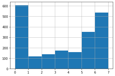
And, as we did last week, you can plot a simple histogram of the distribution of a variable across the dataset. So if you want to look at how ‘radio’ (as in, how many days per week a person uses radio) is distributed among your sample, e.g., you can use a histogram.
#Here, 'bins' refers to how many bars we want, essentially. If you don't specify, python/pandas will guess based
#on the dataset. This can be misleading. So if you know how many you want to display, you should specify.

df['radio'].hist(bins=7)
<AxesSubplot:>
#Try to plot a histogram of internet news use here:
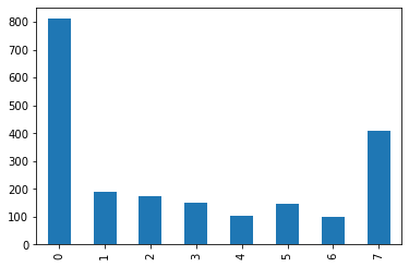
One of the modules we imported above helps us to make prettier plots (but no, it’s not called “pretty plot” like “pretty print”). Here we can plot the value counts for internet news use in a bar chart, again sorted by the index.
In particular, the histogram above is very good for continous variables, that we want to ‘bin’ into fewer bins (=bars). But if we only have a small number of discrete values (like here: the integers from 0 to 7), then the alignment of the labels above may be more confusing.
Let’s try to use .plot() to make a bar chart:
df['internet'].value_counts().sort_index().plot(kind='bar')
<AxesSubplot:>
POP QUIZ!
Can you integrate this plotting method in your for-loop (from above) to get a nice series of plots? Fill in the missing line of code, below. But keep the plt.show() command afterward, in order to display all plots.
for medium in ['radio','newspaper','tv','internet']:
    print(medium.upper())
    print(df[medium].value_counts(sort=True, normalize=True))
    print('-------------------------------------------\n')
    #YOUR CODE HERE
    plt.show()
RADIO
0    0.292167
7    0.199904
5    0.169149
3    0.082653
4    0.075925
2    0.066314
6    0.058145
1    0.055742
Name: radio, dtype: float64
-------------------------------------------

NEWSPAPER
0    0.356559
6    0.252763
7    0.126862
1    0.081211
2    0.061028
5    0.055262
3    0.038443
4    0.027871
Name: newspaper, dtype: float64
-------------------------------------------

TV
7    0.271024
5    0.149447
0    0.143681
6    0.112446
4    0.095147
3    0.082653
2    0.074003
1    0.071600
Name: tv, dtype: float64
-------------------------------------------

INTERNET
0    0.389716
7    0.197021
1    0.090822
2    0.083614
3    0.072081
5    0.069678
4    0.049976
6    0.047093
Name: internet, dtype: float64
-------------------------------------------
And instead of (or in addition to) the plt.show(), you can also save these plots to your folder on your computer. These are very high quality images then, that could be used in a piece (if you provided appropriate axis titles, etc.), and you can specify the figure size and DPI.
Note here we’ve added a ‘figsize’ specification to the end of the plot method in your missing line of code. You can play around with different figure sizes to see what happens, if you display them here using plt.show().
for medium in ['radio','newspaper','tv','internet']:
    print(medium.upper())
    print(df[medium].value_counts(sort=True, normalize=True))
    print('-------------------------------------------\n')
    #YOUR CODE HERE ...(kind='bar', figsize=(6,4))
    plt.savefig('{}.png'.format(medium), dpi=400)
    plt.show()

#Now go check your folder and see if the image files have shown up.
#Note that we have to use the curly brackets and .format(medium) to give
#the relevant title to each figure.
RADIO
0    0.292167
7    0.199904
5    0.169149
3    0.082653
4    0.075925
2    0.066314
6    0.058145
1    0.055742
Name: radio, dtype: float64
-------------------------------------------
<Figure size 432x288 with 0 Axes>
NEWSPAPER
0    0.356559
6    0.252763
7    0.126862
1    0.081211
2    0.061028
5    0.055262
3    0.038443
4    0.027871
Name: newspaper, dtype: float64
-------------------------------------------
<Figure size 432x288 with 0 Axes>
TV
7    0.271024
5    0.149447
0    0.143681
6    0.112446
4    0.095147
3    0.082653
2    0.074003
1    0.071600
Name: tv, dtype: float64
-------------------------------------------
<Figure size 432x288 with 0 Axes>
INTERNET
0    0.389716
7    0.197021
1    0.090822
2    0.083614
3    0.072081
5    0.069678
4    0.049976
6    0.047093
Name: internet, dtype: float64
-------------------------------------------
<Figure size 432x288 with 0 Axes>
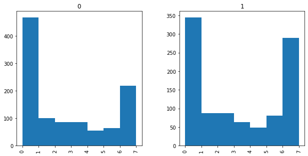
Plots grouped by variables
You can also create comparison histograms, side-by-side, for different values of a variable. For example, let’s look at the histogram of internet news use for men and women in this dataset.
Here, we’re using the “by=[‘ ‘]” command to specify which grouping variable we want, and again specifying the bins and the figure size, both of which you can play around with.
df.hist(column='internet', by=['gender'], bins=7, figsize=(10,5))
array([<AxesSubplot:title={'center':'0'}>,
       <AxesSubplot:title={'center':'1'}>], dtype=object)
Statistical tests and subsetting datasets
Now, if we want to move onto statistical comparisons, we can run our normal, basic statistics here in python as well. There’s no need to import your datset to SPSS to do this, if you want to know whether a specific difference is significant, for example.
T-tests
Let’s start with a t-test, comparing the mean internet news use for men and women that we just examined in the histograms.
In order to do this, we have to create two new little dataframes out of our first one - one for men, one for women.
We are using the ability to filter a dataframe (e.g., df[df['gender']==1] to create a dataframe only for males; adding ['internet'] at the end selects only the column for internet). This can be handy to select only relevant data for your story out of a much larger dataset!
males_internet = df[df['gender']==1]['internet']
females_internet = df[df['gender']==0]['internet']
Each of these new dataframes can then be described and explored as we do with any pandas dataframe, and using .describe(), remember, gives us the mean score (handy for our t-test!).
males_internet.describe()
count    1002.000000
mean        3.021956
std         2.856809
min         0.000000
25%         0.000000
50%         2.000000
75%         6.000000
max         7.000000
Name: internet, dtype: float64
females_internet.describe()
count    1079.000000
mean        2.370714
std         2.682610
min         0.000000
25%         0.000000
50%         1.000000
75%         5.000000
max         7.000000
Name: internet, dtype: float64
We see the male mean is 3.02, and the female mean is 2.37. But we don’t know if, based on the sample, this is a significant difference. We don’t want to make misleading claims in our story! So, run a t-test. (Specifically, an independent samples t-test.)
The results return the test statistic, p-value, and the degrees of freedom (in that order).
ttest_ind(males_internet,females_internet)
(5.363006854632657, 9.094061516694626e-08, 2079.0)
We see that males use the internet significantly more often than females (that e-08 means the p-value is REALLY tiny).
We could also do some pretty-printing if we wanted to, to display this more nicely for ourselves.
The “._f” specification is how many decimal places; the integer before the colon is the position of the output from the default t-test command.
And again, here we see the use of “.format()” as a method to input something from the ongoing calculation.
results = ttest_ind(males_internet,females_internet)
print('t({2:.0f}) = {0:.3f}, p = {1:.3f}'.format(*results))
t(2079) = 5.363, p = 0.000
Let’s look into some continous variables. First of all, let us create one: We make a subset of our dataframe that contains only the media variables, apply the .mean() method to it (axis = 1 means that we want to apply it row-wise), and then we assign the result of this to a new colum in the original dataframe.
df['meanmedia'] = df[['radio','internet','newspaper','tv']].mean(axis=1)
#We can then plot this mean media usage (for news) by age, using a scatterplot, e.g.
#Feel free to play around with the color parameters, and remember to use help commands to
#find out more about formatting these plots.

df.plot.scatter(x='age', y='meanmedia', c='blue')
<AxesSubplot:xlabel='age', ylabel='meanmedia'>
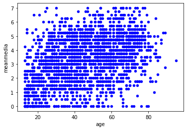
There are obviously many more possibilities here, including running a correlation between age and mean media use, for example, or using ANOVAs if you had more than 2 groups to compare, etc. We don’t have time to show all of this to you in class, but remember there is a ton of resources online, so you should just search away to find what you need. If you have problems understanding specific modules or commands you find online, you can approach us during our open lab sessions with questions as to how to apply these techniques to your own data story.
Before we finish, let’s play around with some more graphics
The seaborn library (which we imported at the beginning) offers a lot of cool stuff.
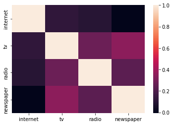
First, we’ll make a simple correlation matrix of the four media in this datset.
corrmatrix = df[['internet','tv','radio','newspaper']].corr()
corrmatrix
| internet | tv | radio | newspaper | |
|---|---|---|---|---|
| internet | 1.000000 | 0.121192 | 0.098797 | -0.005689 |
| tv | 0.121192 | 1.000000 | 0.270031 | 0.350694 |
| radio | 0.098797 | 0.270031 | 1.000000 | 0.230926 |
| newspaper | -0.005689 | 0.350694 | 0.230926 | 1.000000 |
But think of ways that are more useful to display this to audiences, who may not want to deal with a correlation matrix. Heatmaps are one way to do this:
sns.heatmap(corrmatrix)
<AxesSubplot:>
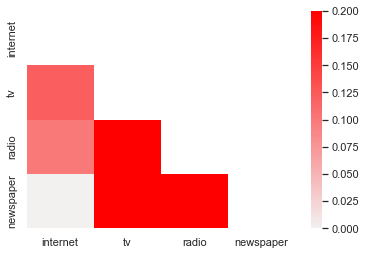
This looks okay, but is a bit redundant, so it would be great if we could sort of ‘white out’ the unnecessary (replicated) top triangle of the chart, and use colors that are more intuitive - usually darker means a stronger relationship in a heat map, right?
Here, note that even Damian (EVEN DAMIAN!) can’t reproduce all of this out of his head. But if you look around online, or use what we show you here and adapt it, you can do a lot of amazing graphics stuff.
sns.set(style="white")
mask = np.zeros_like(corrmatrix, dtype=np.bool)
mask[np.triu_indices_from(mask)] = True
cmap = sns.light_palette("red",as_cmap=True)
sns.heatmap(corrmatrix,mask=mask,cmap=cmap,vmin=0,vmax=.2)
/Users/fhopp/opt/anaconda3/envs/dj21/lib/python3.7/site-packages/ipykernel_launcher.py:2: DeprecationWarning: `np.bool` is a deprecated alias for the builtin `bool`. To silence this warning, use `bool` by itself. Doing this will not modify any behavior and is safe. If you specifically wanted the numpy scalar type, use `np.bool_` here.
Deprecated in NumPy 1.20; for more details and guidance: https://numpy.org/devdocs/release/1.20.0-notes.html#deprecations
<AxesSubplot:>
So…
there are lots of possibilities here. Remember: google is your friend here!
More (non-graded) homework :)
Using the Iris dataset from last Wednesday, try the following:
Describe the dataset
Find the value counts of the ‘species’ column
Describe the dataset for each of the species separately.
Transpose the output for this previous command.
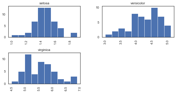
Create side-by-side histograms of petal length for each species.
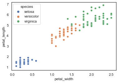
Regardless whether you were able to do that, here’s a really cool graphic to show you. In this case, we’re plotting petal width by petal length, with a different color for each species. This also uses the seaborn library (indicated by sns). Because of the nature of this dataset and the values within it, it works quite well.)
iris = pd.read_csv('https://raw.githubusercontent.com/mwaskom/seaborn-data/master/iris.csv')
iris.groupby('species').describe().T
| species | setosa | versicolor | virginica | |
|---|---|---|---|---|
| sepal_length | count | 50.000000 | 50.000000 | 50.000000 |
| mean | 5.006000 | 5.936000 | 6.588000 | |
| std | 0.352490 | 0.516171 | 0.635880 | |
| min | 4.300000 | 4.900000 | 4.900000 | |
| 25% | 4.800000 | 5.600000 | 6.225000 | |
| 50% | 5.000000 | 5.900000 | 6.500000 | |
| 75% | 5.200000 | 6.300000 | 6.900000 | |
| max | 5.800000 | 7.000000 | 7.900000 | |
| sepal_width | count | 50.000000 | 50.000000 | 50.000000 |
| mean | 3.428000 | 2.770000 | 2.974000 | |
| std | 0.379064 | 0.313798 | 0.322497 | |
| min | 2.300000 | 2.000000 | 2.200000 | |
| 25% | 3.200000 | 2.525000 | 2.800000 | |
| 50% | 3.400000 | 2.800000 | 3.000000 | |
| 75% | 3.675000 | 3.000000 | 3.175000 | |
| max | 4.400000 | 3.400000 | 3.800000 | |
| petal_length | count | 50.000000 | 50.000000 | 50.000000 |
| mean | 1.462000 | 4.260000 | 5.552000 | |
| std | 0.173664 | 0.469911 | 0.551895 | |
| min | 1.000000 | 3.000000 | 4.500000 | |
| 25% | 1.400000 | 4.000000 | 5.100000 | |
| 50% | 1.500000 | 4.350000 | 5.550000 | |
| 75% | 1.575000 | 4.600000 | 5.875000 | |
| max | 1.900000 | 5.100000 | 6.900000 | |
| petal_width | count | 50.000000 | 50.000000 | 50.000000 |
| mean | 0.246000 | 1.326000 | 2.026000 | |
| std | 0.105386 | 0.197753 | 0.274650 | |
| min | 0.100000 | 1.000000 | 1.400000 | |
| 25% | 0.200000 | 1.200000 | 1.800000 | |
| 50% | 0.200000 | 1.300000 | 2.000000 | |
| 75% | 0.300000 | 1.500000 | 2.300000 | |
| max | 0.600000 | 1.800000 | 2.500000 |
iris.hist(column='petal_length', by=['species'], figsize=(10,5))
array([[<AxesSubplot:title={'center':'setosa'}>,
        <AxesSubplot:title={'center':'versicolor'}>],
       [<AxesSubplot:title={'center':'virginica'}>, <AxesSubplot:>]],
      dtype=object)
sns.scatterplot(x="petal_width", y="petal_length", hue="species", data=iris)
<AxesSubplot:xlabel='petal_width', ylabel='petal_length'>
Appendix: Multivariate statistical analysis
For those who are interested, here’s a brief bit on multivariate analyses. Here, we’re focusing on the same comparison of internet news use between men and women, but first, let’s see whether that holds when we control for political interest.
Before we can do that, we have to bring in another datset, however, and join it. You can access this dataset and save it from the following URL: https://raw.githubusercontent.com/damian0604/bdaca/master/ipynb/intpol.csv
We’ll talk more about aggregating/merging datasets in a later session, so for now just go with it.
# intpol=pd.read_csv('intpol.csv') # if you stored it locally
intpol=pd.read_csv('https://raw.githubusercontent.com/damian0604/bdaca/master/ipynb/intpol.csv') # if reading it directly from the website
combined = df.join(intpol)
combined
| gender | age | education | radio | newspaper | tv | internet | meanmedia | intpol | |
|---|---|---|---|---|---|---|---|---|---|
| 0 | 1 | 71 | 4.0 | 5 | 6 | 5 | 0 | 4.00 | 4 |
| 1 | 1 | 40 | 2.0 | 6 | 0 | 0 | 0 | 1.50 | 1 |
| 2 | 1 | 41 | 2.0 | 4 | 3 | 7 | 3 | 4.25 | 4 |
| 3 | 0 | 65 | 5.0 | 0 | 0 | 5 | 0 | 1.25 | 4 |
| 4 | 0 | 39 | 2.0 | 0 | 1 | 7 | 7 | 3.75 | 1 |
| ... | ... | ... | ... | ... | ... | ... | ... | ... | ... |
| 2076 | 0 | 49 | 5.0 | 3 | 6 | 6 | 0 | 3.75 | 5 |
| 2077 | 0 | 51 | 4.0 | 7 | 7 | 5 | 5 | 6.00 | 6 |
| 2078 | 1 | 31 | 6.0 | 3 | 5 | 5 | 6 | 4.75 | 7 |
| 2079 | 0 | 58 | 6.0 | 3 | 3 | 1 | 0 | 1.75 | 3 |
| 2080 | 1 | 21 | 3.0 | 2 | 6 | 6 | 4 | 4.50 | 5 |
2081 rows × 9 columns
Let’s do an OLS regression. In order to do so, we need to define a model and then run it. When defining the model, you create the equation in the following manner:
First you include your dependent variable, followed by the ~ sign
Then you include the independent variables (separated by the + sign)
m1 = smf.ols(formula='internet ~ age + gender + education', data=combined).fit()
m1.summary()
| Dep. Variable: | internet | R-squared: | 0.085 |
|---|---|---|---|
| Model: | OLS | Adj. R-squared: | 0.084 |
| Method: | Least Squares | F-statistic: | 63.91 |
| Date: | Fri, 05 Nov 2021 | Prob (F-statistic): | 1.65e-39 |
| Time: | 11:19:47 | Log-Likelihood: | -4951.8 |
| No. Observations: | 2065 | AIC: | 9912. |
| Df Residuals: | 2061 | BIC: | 9934. |
| Df Model: | 3 | ||
| Covariance Type: | nonrobust |
| coef | std err | t | P>|t| | [0.025 | 0.975] | |
|---|---|---|---|---|---|---|
| Intercept | 1.1512 | 0.233 | 4.941 | 0.000 | 0.694 | 1.608 |
| age | -0.0119 | 0.003 | -3.675 | 0.000 | -0.018 | -0.006 |
| gender | 0.6224 | 0.118 | 5.283 | 0.000 | 0.391 | 0.853 |
| education | 0.4175 | 0.035 | 11.763 | 0.000 | 0.348 | 0.487 |
| Omnibus: | 976.493 | Durbin-Watson: | 1.978 |
|---|---|---|---|
| Prob(Omnibus): | 0.000 | Jarque-Bera (JB): | 187.053 |
| Skew: | 0.481 | Prob(JB): | 2.41e-41 |
| Kurtosis: | 1.882 | Cond. No. | 199. |
Notes:
[1] Standard Errors assume that the covariance matrix of the errors is correctly specified.
m2 = smf.ols(formula='internet ~ age + gender + education + intpol', data=combined).fit()
m2.summary()
| Dep. Variable: | internet | R-squared: | 0.100 |
|---|---|---|---|
| Model: | OLS | Adj. R-squared: | 0.099 |
| Method: | Least Squares | F-statistic: | 57.45 |
| Date: | Fri, 05 Nov 2021 | Prob (F-statistic): | 5.12e-46 |
| Time: | 11:19:47 | Log-Likelihood: | -4934.5 |
| No. Observations: | 2065 | AIC: | 9879. |
| Df Residuals: | 2060 | BIC: | 9907. |
| Df Model: | 4 | ||
| Covariance Type: | nonrobust |
| coef | std err | t | P>|t| | [0.025 | 0.975] | |
|---|---|---|---|---|---|---|
| Intercept | 1.0389 | 0.232 | 4.481 | 0.000 | 0.584 | 1.494 |
| age | -0.0196 | 0.003 | -5.642 | 0.000 | -0.026 | -0.013 |
| gender | 0.5212 | 0.118 | 4.413 | 0.000 | 0.290 | 0.753 |
| education | 0.3447 | 0.037 | 9.240 | 0.000 | 0.272 | 0.418 |
| intpol | 0.2230 | 0.038 | 5.910 | 0.000 | 0.149 | 0.297 |
| Omnibus: | 763.270 | Durbin-Watson: | 1.972 |
|---|---|---|---|
| Prob(Omnibus): | 0.000 | Jarque-Bera (JB): | 179.407 |
| Skew: | 0.483 | Prob(JB): | 1.10e-39 |
| Kurtosis: | 1.926 | Cond. No. | 200. |
Notes:
[1] Standard Errors assume that the covariance matrix of the errors is correctly specified.
We can also do a test to see whether M2 is better than M1 (it is, in this case:) (see also http://www.statsmodels.org/stable/generated/statsmodels.regression.linear_model.OLSResults.compare_lr_test.html?highlight=compare_lr_test )
m2.compare_lr_test(m1)
(34.71733114293056, 3.8122257183791596e-09, 1.0)
Hexplots
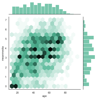
We have seen scatterplots at work above. Scatterplots are a cool way to show the relationship between two variables, but they mainly work well if both variables have a lot of different values (say, the money people earn in Euros’ (and not in categories!), or the time people spent on Facebook in exact minutes). However, if we have only few possible values (such as the integers from 0 to 7, as in our examples above), the dots in the scatterplot will overlap, and an observation that only occurs one single time looks exactly like an observation that occurs 1000 times.
A hexplot is very much like a scatterplot, but the more observations overlap at the same (hexagon-shaped) place in the graph, the darker it gets.
To make it even more informative, we add histograms of the two variables in the margin, so that you can immediately get an idea of the distributions. This, again, helps us to understand whether there are just a few (very old, very young) people that behave in some way (no media at all, media every day), or whether it’s a general pattern.
sns.jointplot(combined['age'], combined['meanmedia'] ,
              kind="hex", color="#4CB391")
/Users/fhopp/opt/anaconda3/envs/dj21/lib/python3.7/site-packages/seaborn/_decorators.py:43: FutureWarning: Pass the following variables as keyword args: x, y. From version 0.12, the only valid positional argument will be `data`, and passing other arguments without an explicit keyword will result in an error or misinterpretation.
  FutureWarning
<seaborn.axisgrid.JointGrid at 0x7fae60212f90>